Electric City Aquarium
A touchscreen exhibit experience concept designed for Electric City Aquarium & Reptile Den, Scranton, PA
Overview
Electric City Aquarium & Reptile Den is a 20,000-square-foot indoor attraction in downtown Scranton, Pennsylvania, home to more than 75 exhibits and 250+ species of fish, reptiles, mammals, and birds. The facility's stated mission is to educate, inspire, and encourage conservation — transporting guests, exhibit by exhibit, into the regions each animal calls home.
This project is a self-directed concept design for an interactive touchscreen kiosk that extends that mission beyond the exhibit glass: a standalone station where guests explore where animals live in the wild and how at-risk each species is, building the kind of conservation literacy a placard alone can't deliver.
Plan with purpose
Static signage can name a species and its habitat, but it can't easily show a guest of any age — from a five-year-old on a school trip to a sixty-five-year-old member — how that animal's population is actually faring, or let them explore that question at their own pace. Before any screen design started, the brief was scoped around four hard constraints:
Must work fully offline on in-facility touchscreen hardware, with no dependency on a live connection
Must serve a wide age range through a single interface — no separate "kids' mode" and "adult mode"
Must let facility staff add new animal profiles later without a UI rebuild (an out-of-scope CMS handles the data layer)
Covers roughly 15–20 species across the facility's existing exhibits
These constraints shaped every downstream decision: the offline requirement ruled out any live-data widgets, and the staff-extensibility requirement meant every animal profile had to work as a repeatable template, not a one-off layout.
Explore ideas
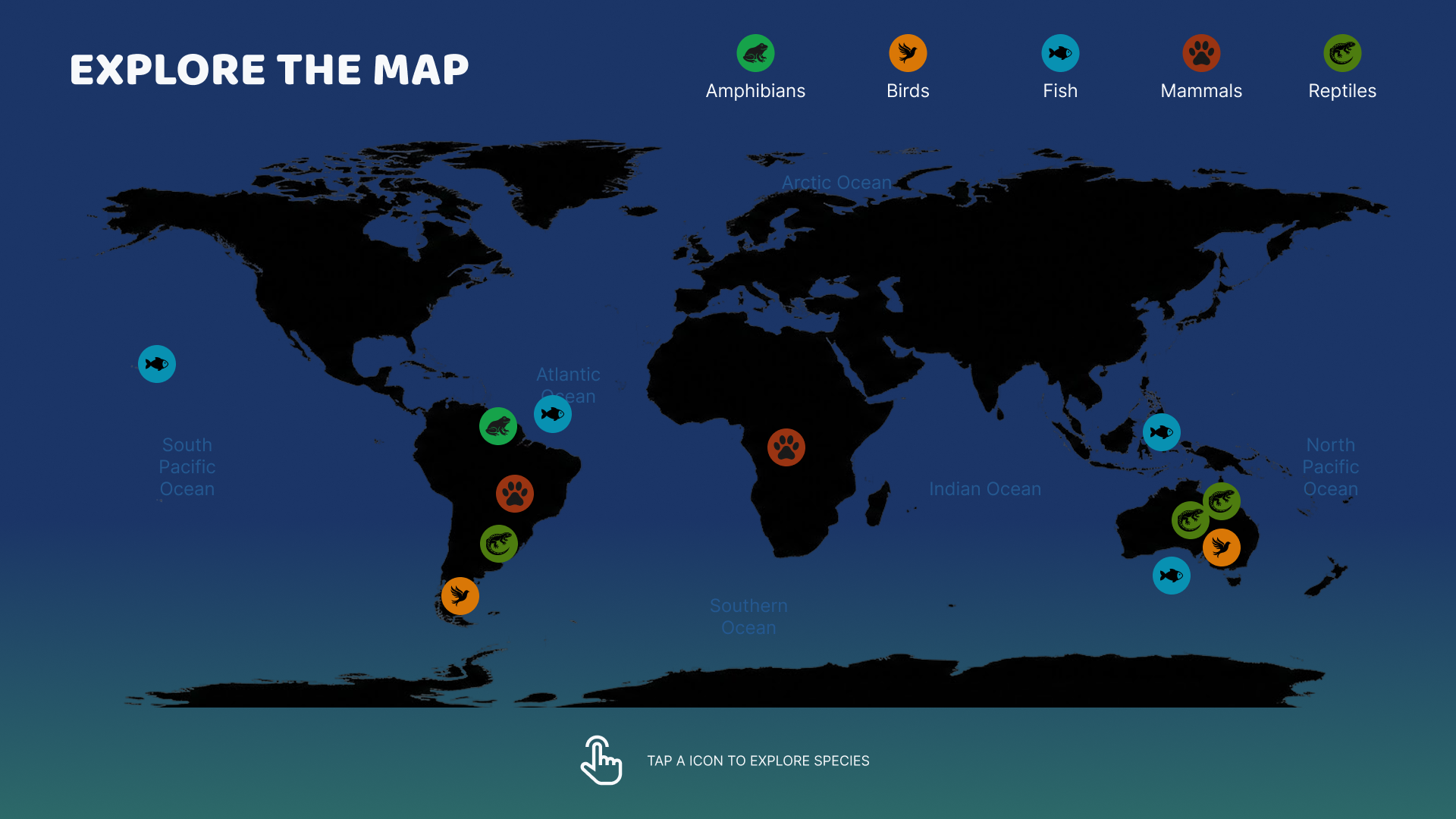
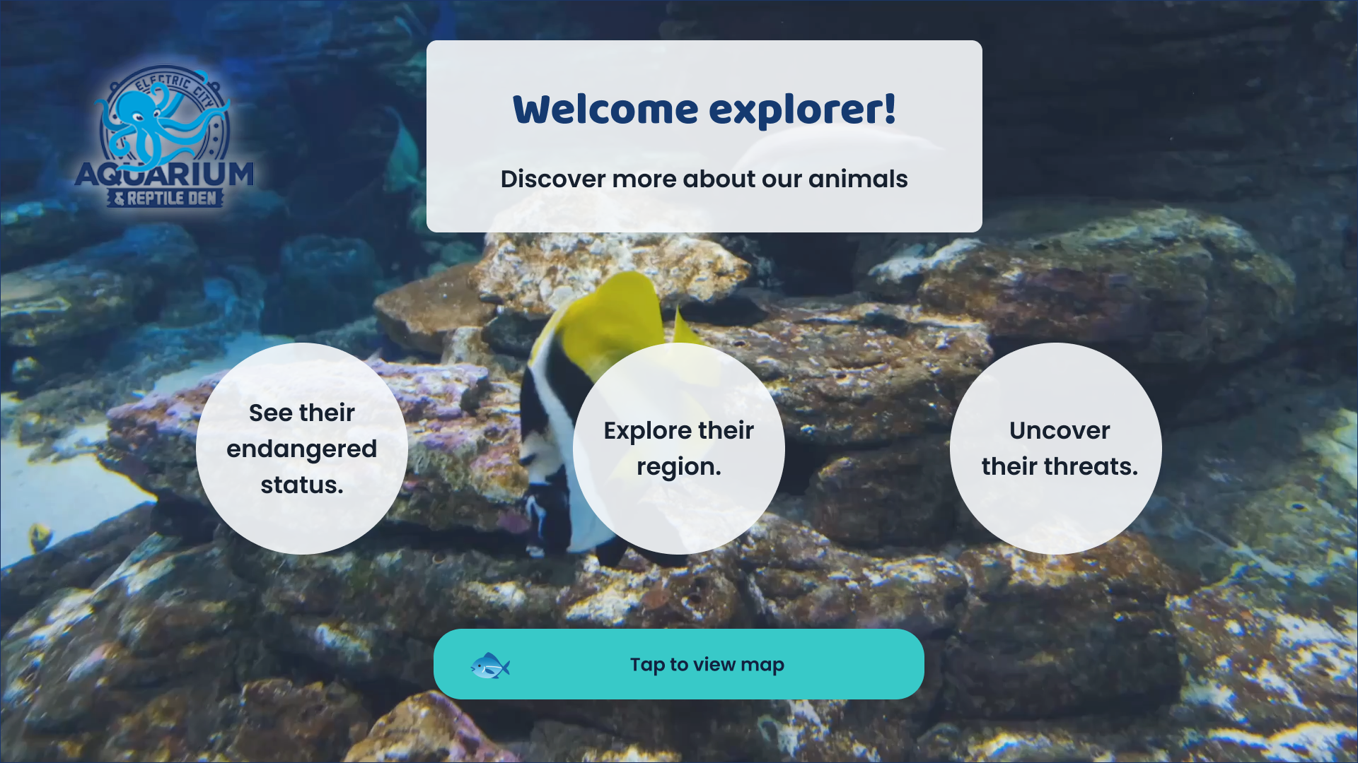
Each of the three core screens — Home, Interactive World Map, and Animal Fact Sheet — moved through low-fidelity wireframes first, to lock structure and flow before any visual style was applied. From there, the World Map explored a tap-to-browse model: guests select a taxonomic icon (amphibian, bird, fish, mammal, reptile) or a region directly on the map, with color-coded pins grouping species by class and a persistent footer prompt keeping the interaction obvious for first-time users.
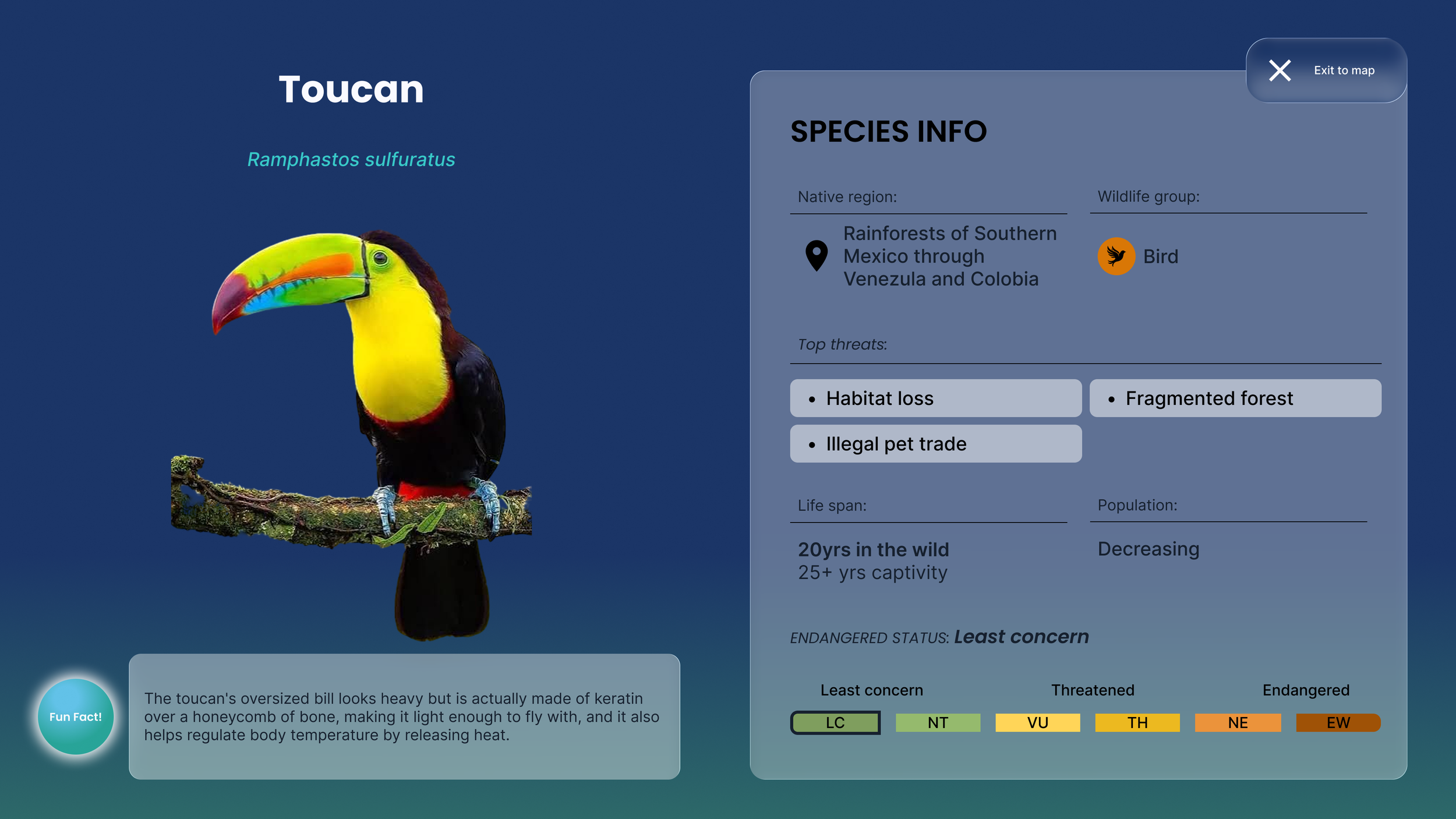
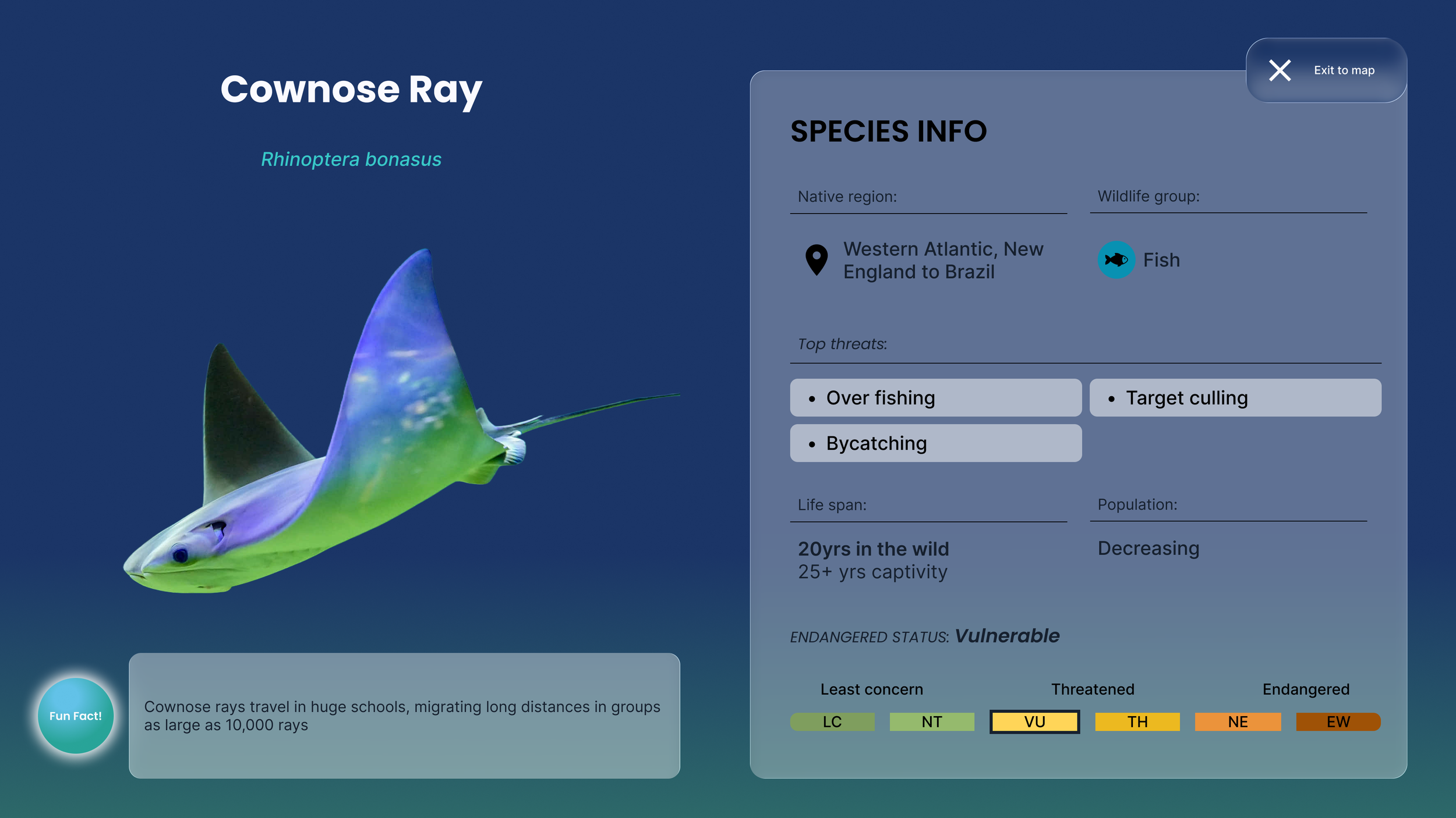
The Animal Fact Sheet went through the most exploration, since it carried the most information: a photo and fun fact paired with a structured species-info panel covering wildlife group, native region, top threats, and conservation status. Multiple layout directions were tested — including a denser, icon-and-divider-driven structure and a more open, spectrum-based status display — before settling on a hybrid that kept both a fast, at-a-glance status readout and the fuller six-stage risk context underneath it.
Adapt as needed
Placeholder copy hid real problems. Early versions of the Animal Fact Sheet looked balanced with generic "Threat 1 / Threat 2 / Threat 3" text and an unfilled population field — but testing the template against real species data surfaced issues that lorem-ipsum never would have: threats read as plain text with no visual containment, an endangered-status scale with six unlabeled chips was ambiguous about which chips belonged to which risk tier, and an "estimated population" field had no value to show for species where no precise count exists.
Each round of real data — first a dyeing poison frog, then a cownose ray — drove a concrete revision: threats became scannable pill tags, the six-stage spectrum got grouped labels and a highlighted active chip, and the population field was ultimately cut rather than left half-filled, since it added more visual weight than it added information for most species in scope.
Deliver with confidence
The final template pairs a fast answer with real context: a bold, color-coded status readout for an at-a-glance take on conservation risk, backed by the full six-stage spectrum so guests can see where that status sits relative to the entire scale — not just an isolated data point. The same structure — icon-labeled fields, divider-separated sections, consistent pill-tag treatment for threats — now holds up across species with very different data shapes, which was the real test of whether it would scale to the full 15–20 species roster without staff needing to rebuild anything by hand.
The system this produced:
Palette — navy, teal, and sand, with navy matched to the real facility's own brand color (#1B3567), plus a conservation-status semantic scale and habitat-specific accent colors (kelp, coral, deep-sea, wetland, tide pool, open ocean)
Type — Poppins for display and UI headings, Inter for body copy, JetBrains Mono for data labels, giving species data a distinct, field-guide-like register from the surrounding UI text