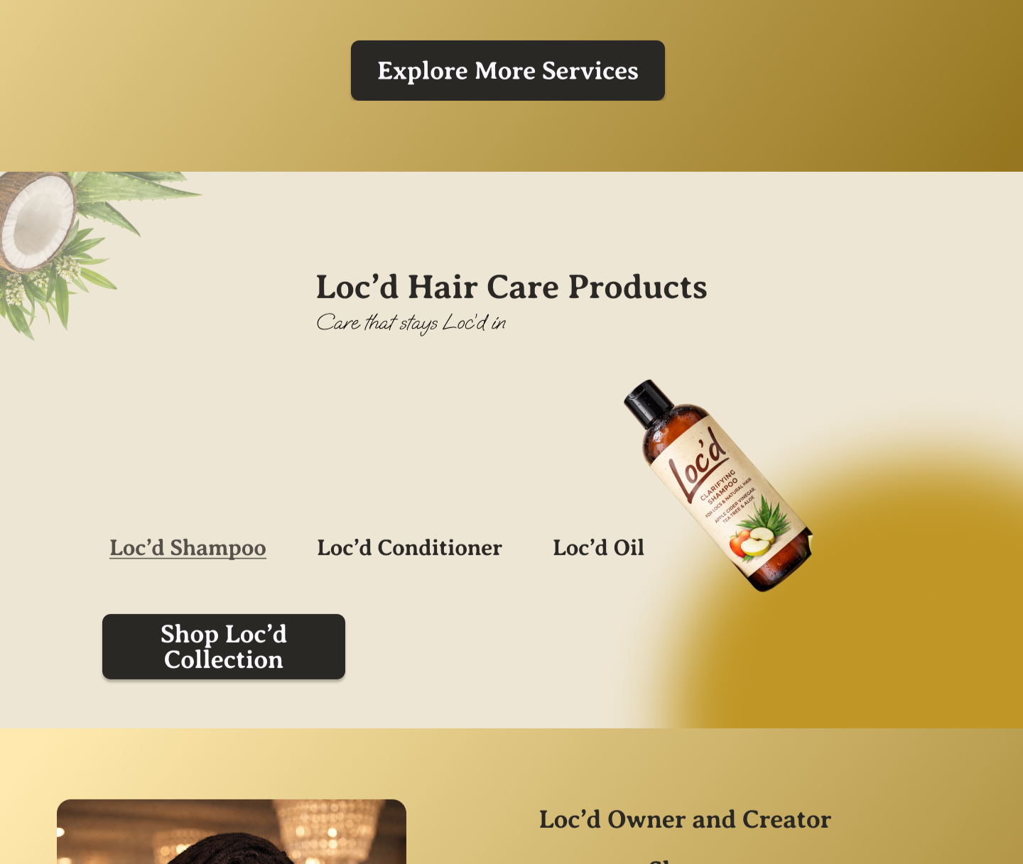
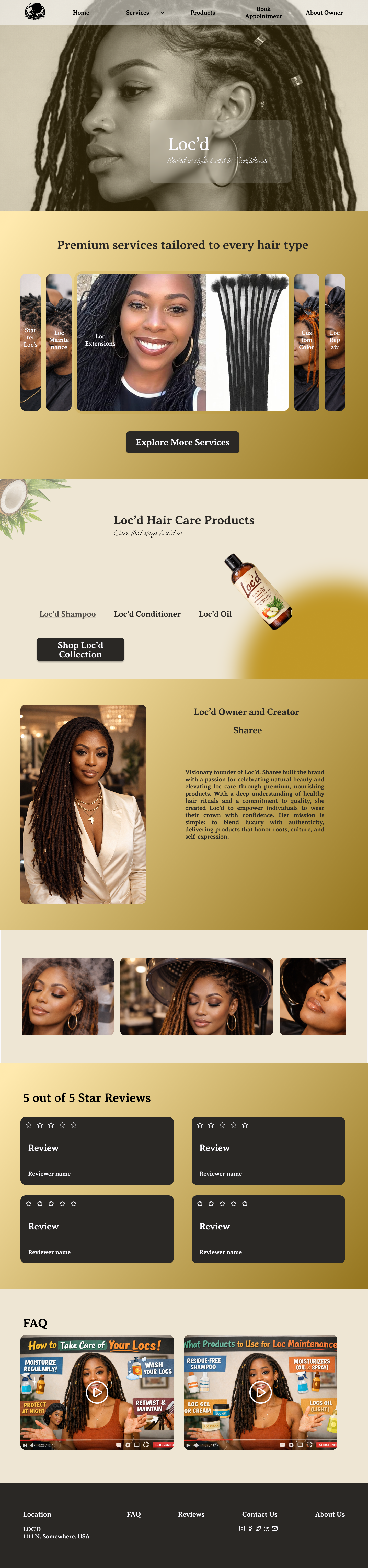
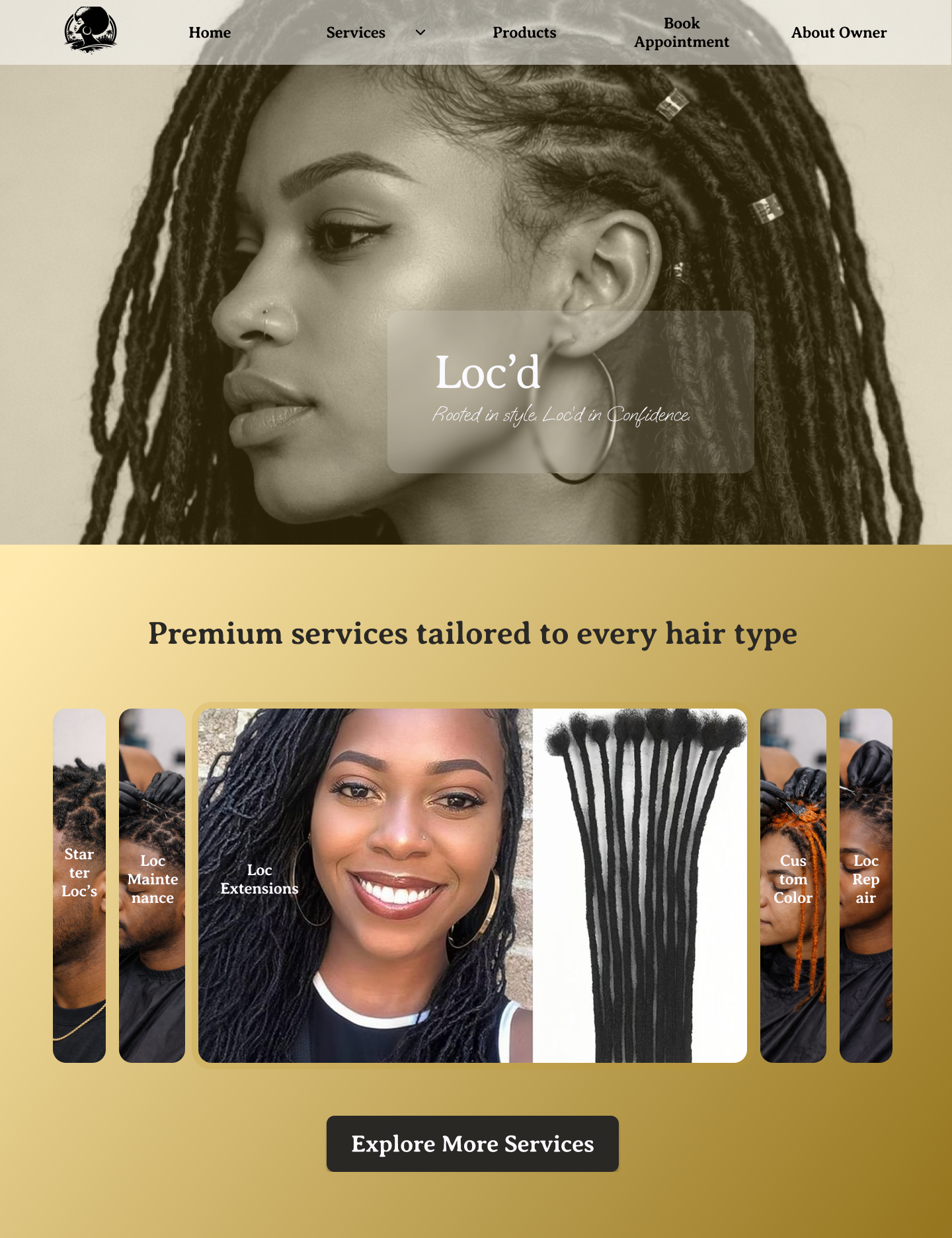
Loc’d
Plan with Purpose
Identified usability issues while browsing a similar website
Noticed unclear visual hierarchy and unintuitive navigation
Observed friction in the overall user journey
Reached out to the owner for context and constraints
Respected decision not to redesign, but used it as a learning opportunity
Defined a clear goal: improve usability through a user-first lens
Explore Ideas
Reframed the project as a self-initiated redesign
Mapped key user flows to understand navigation gaps
Explored alternative layouts to improve structure
Focused on simplifying navigation and reducing cognitive load
Strengthened visual hierarchy to guide user attention
Prioritized clarity and intuitive movement through the site
Adapt as Needed
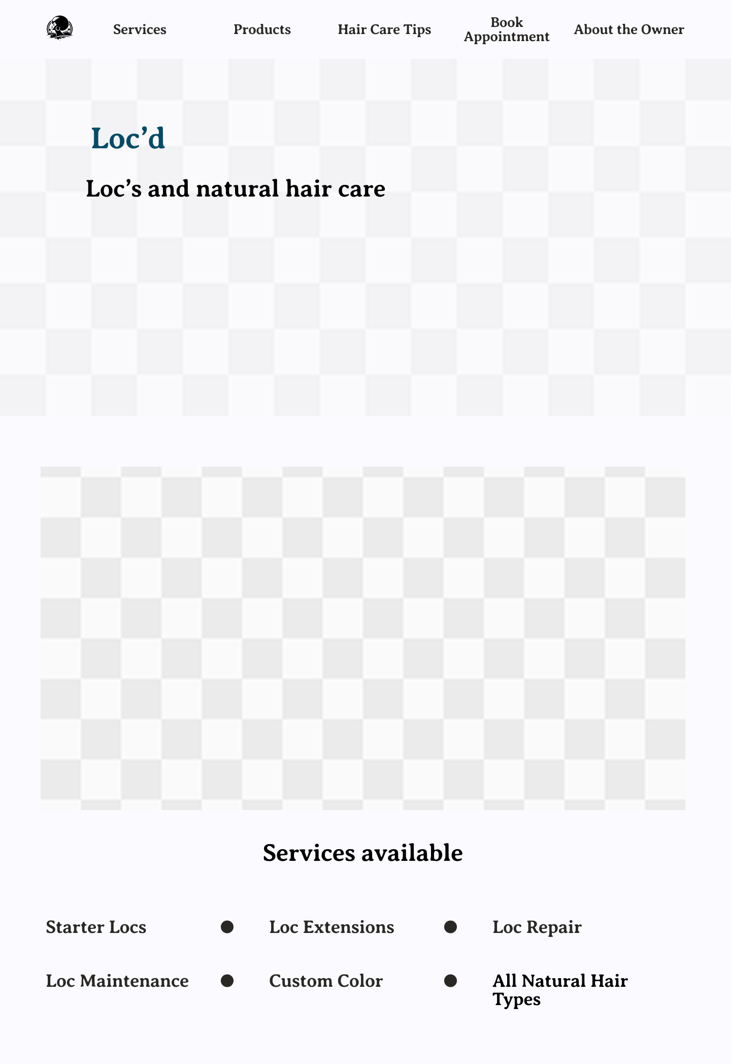
Created wireframes and low-fidelity concepts to test ideas
Iterated on layout, spacing, and content grouping
Experimented with interaction patterns to enhance usability
Refined flows based on reducing friction points
Continuously asked: How can this feel easier for the user?
Adjusted designs to better align with user expectations
Deliver with Confidence
Produced a conceptual redesign focused on clarity and accessibility
Improved overall user experience through intuitive structure
Balanced aesthetics with usability and function
Demonstrated a thoughtful, process-driven design approach
Reinforced a mindset of observation, curiosity, and intentional design
Highlighted the value of identifying opportunities—even without a formal brief