BeauTifful Community Wellness, Inc.
Plan with Purpose
Partnered with BeauTifful Community Wellness, Inc. to understand how the nonprofit's mission and community programs were being communicated (or lost) on their existing site
Identified the need for a cohesive visual identity — no established color system, typography scale, or component library to build from
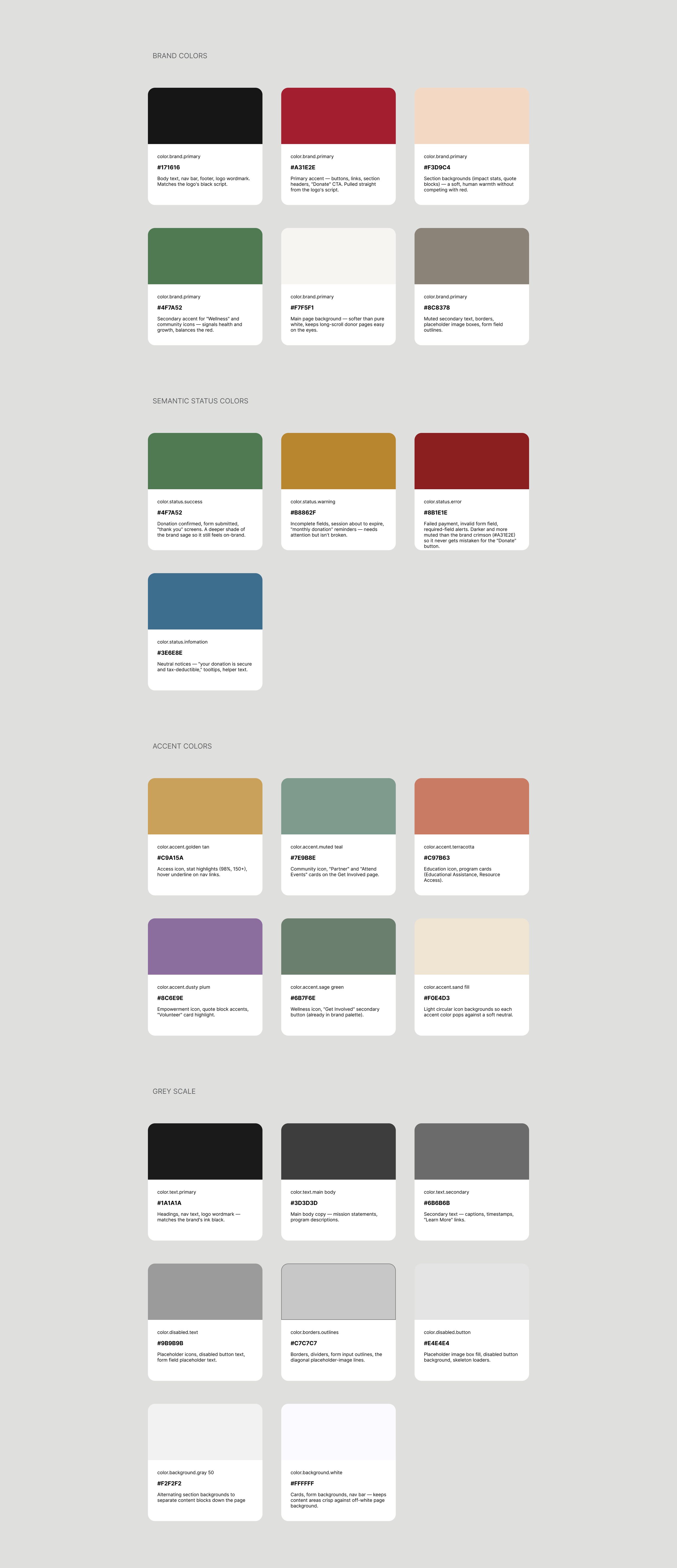
Defined a warm, trustworthy brand palette and semantic color system to support clarity for donors, program participants, and community members alike
Prioritized accessibility and legibility from the outset, given the nonprofit's mixed audience of community members and supporters
Explore Ideas
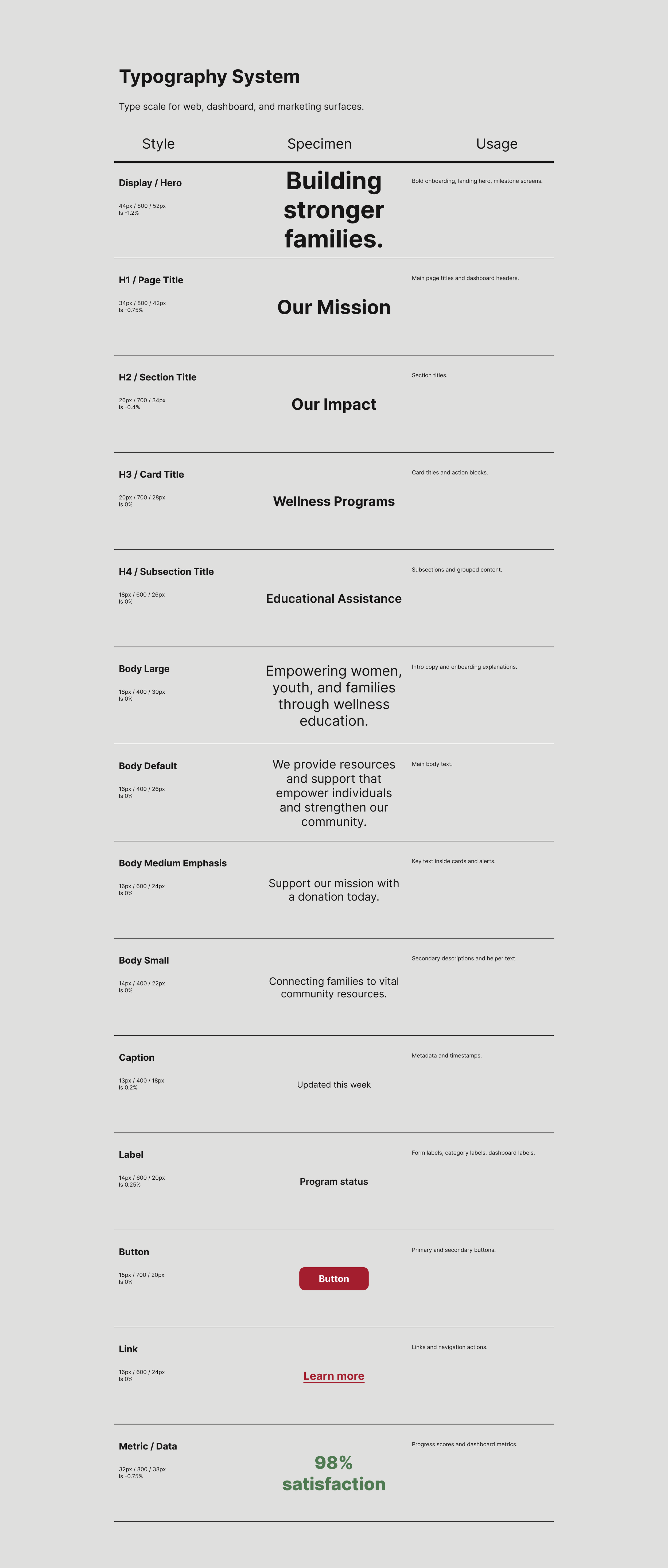
Built a full design system from the ground up: color tokens, a typography scale, semantic status colors, and accent colors to guide consistent use across the site
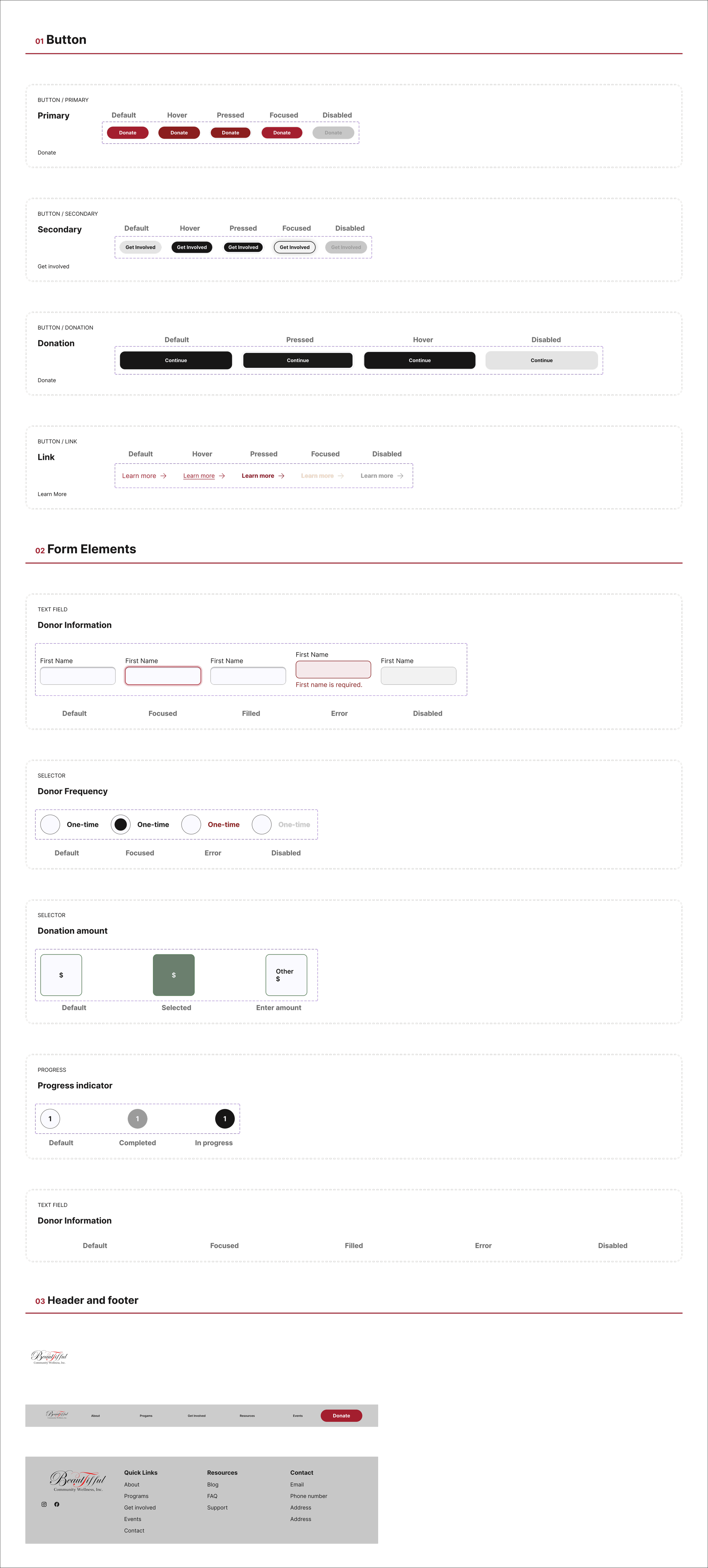
Explored a component library to support scalable, reusable UI patterns for future pages beyond the homepage
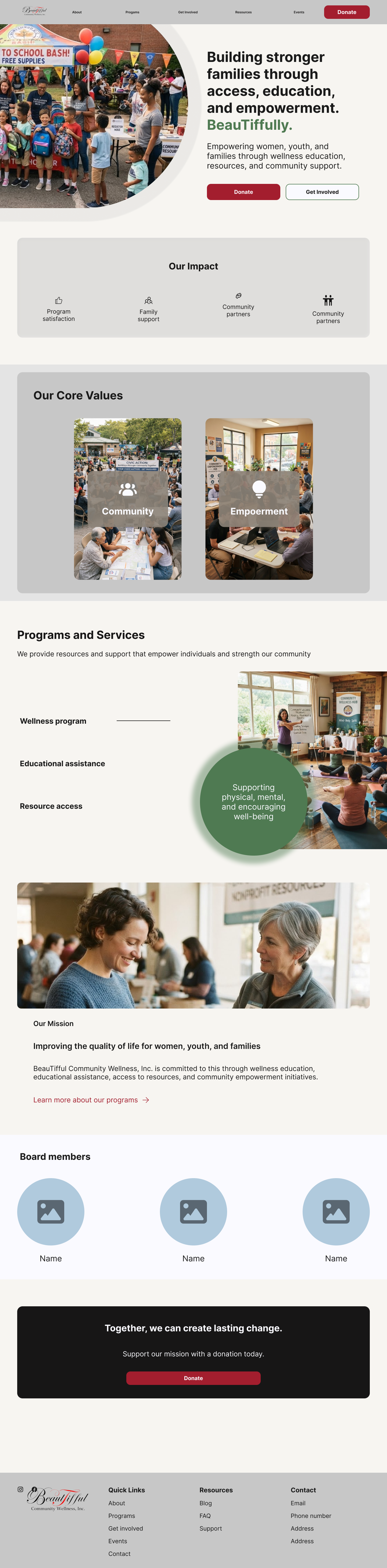
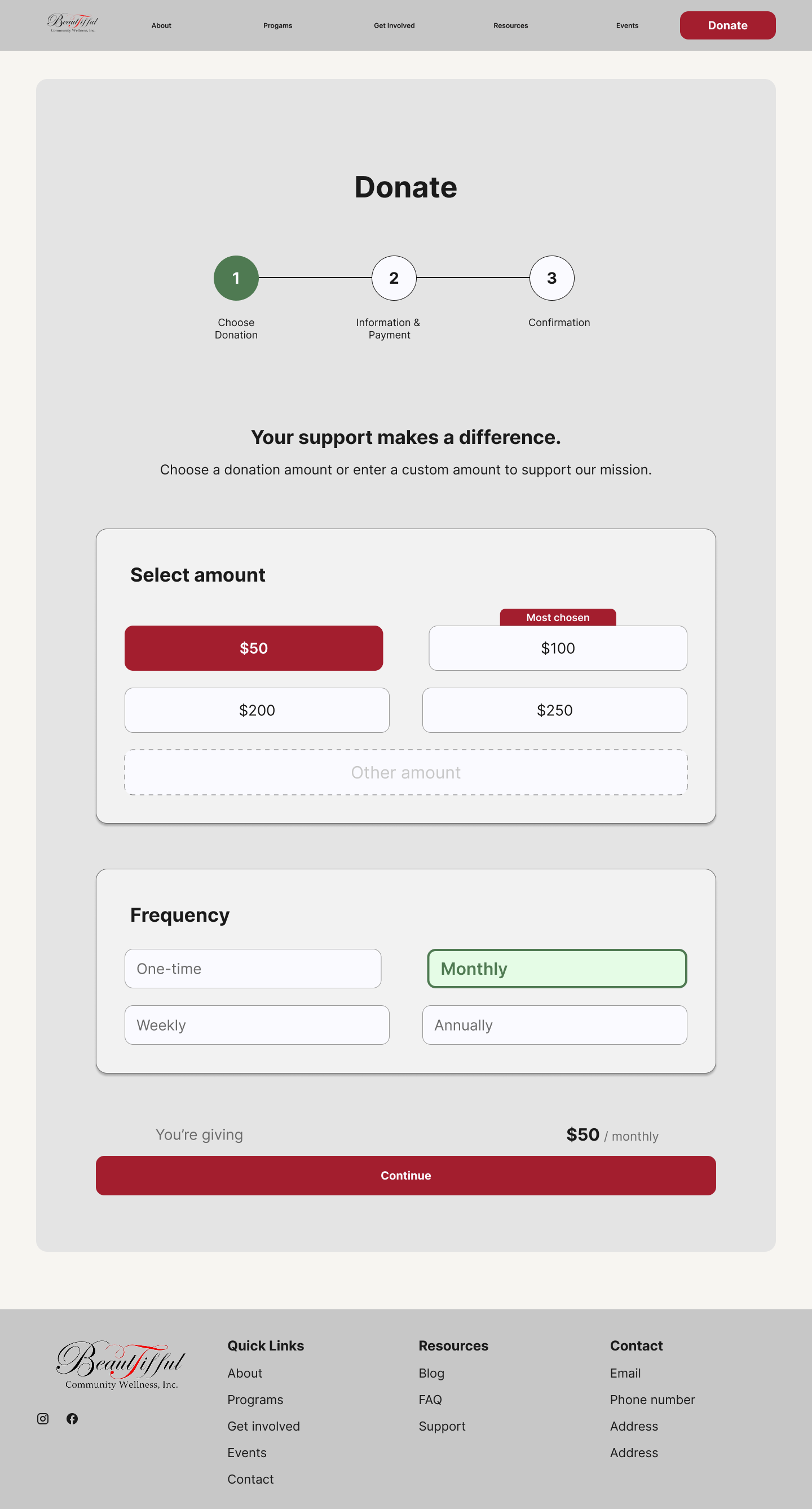
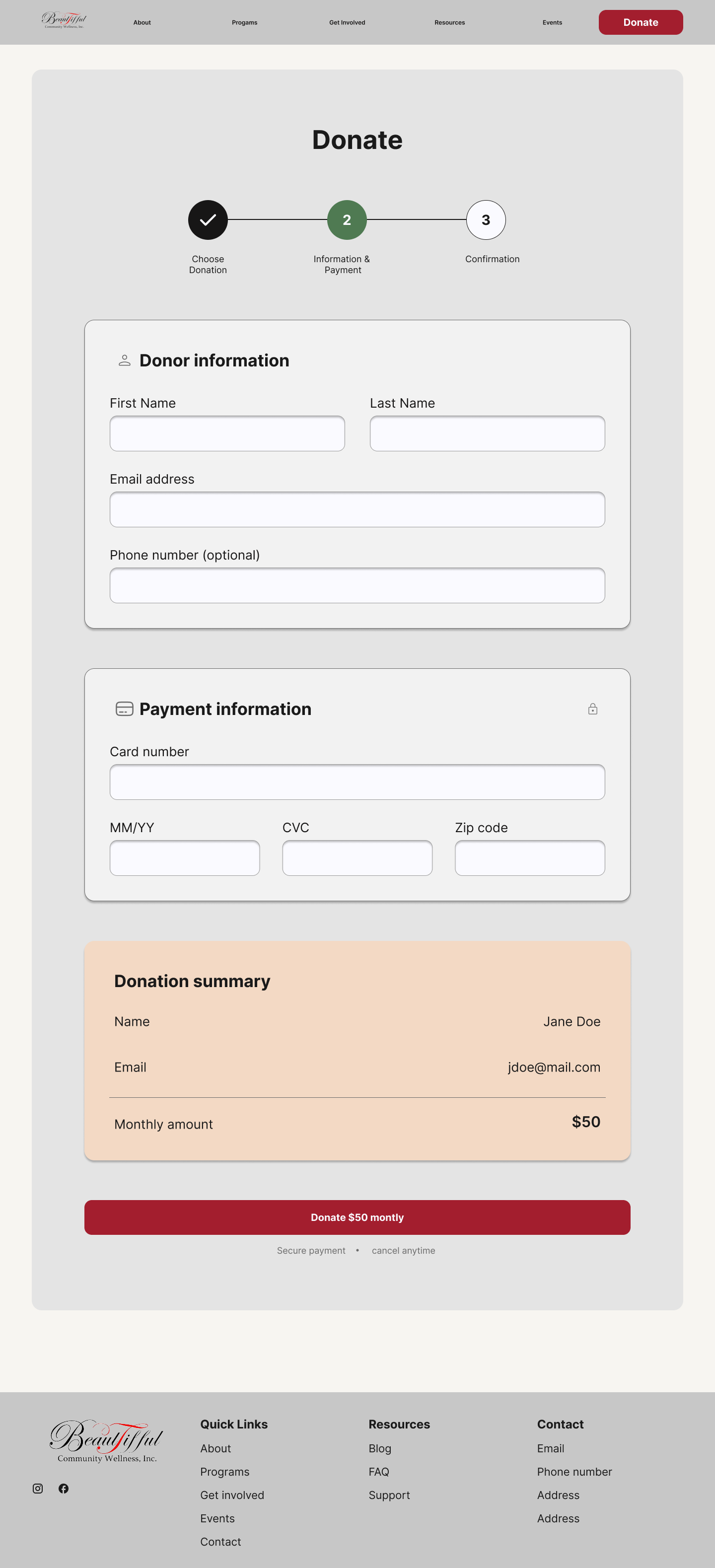
Applied the new color system to an initial homepage mockup to test how the brand would look and feel in context
Balanced a welcoming, community-first aesthetic with the structure needed to support clear navigation and calls to action
Adapt as Needed
Refined color and typography choices based on how they read across different page types and content densities
Iterated on the homepage mockup to ensure the visual hierarchy supported the nonprofit's key messages and donor/community actions
Continuously evaluated design decisions against accessibility standards and the organization's mission-driven tone
Deliver with Confidence
Currently building out the full website redesign using the finalized design system as its foundation
Delivering a scalable set of design tokens and components so the nonprofit can maintain visual consistency as the site grows
Working toward a launch-ready experience that reflects BeauTifful Community Wellness's mission with clarity, warmth, and trust